ABOUT THE APPLICATION
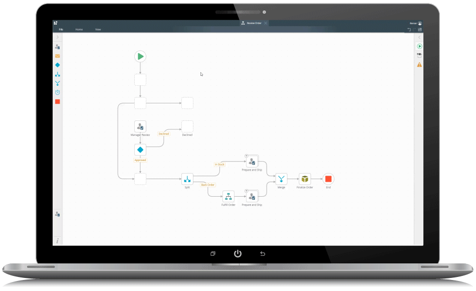
K2's workflow designer is a browser-based design canvas that allows users to create complex workflows without writing code.
Users can integrate forms within workflows, pull information from remote databases, such a Azure SQL, and capture returned data with integration points called SmartObjects. Rules Designer, found within Workflow's configuration panels, allows the user to add logic and functions to steps in order to utilize business logic or complex calculations in the process.
During my time on K2's PM team, I was deeply involved in the decisions that shaped this completely new version. I often took ideas from inception to implementation and shipped over 25 features within the software application. As one of only two UX designers in the company, I not only had a hand in every step of the design process but was a daily advocate for UX practices.
Having been a prior business owner, this role suited me well as I already had a firm grasp of staying objective in order to put customer needs above my own desires or management's “gut feelings". I was accustomed to owning in the full process, learning that which needed to be learned, thinking ahead to optimize efficiency and always keeping an eye on the bigger picture.
MY ROLES
Conducting User Testing and Analyzing Results
Creating Personas or User Roles
Writing Specifications for Designers and Devs
Information Architecture
Creating User Flows
Wireframing
Prototyping in CSS/HTML/Javascript
Creating Interaction Patterns
Adhering to Existing and Creating New Guides and Patterns
Screens, Redlines and Guides for Devs and QA
CHALLENGE
Modernize and simplify the look and functionality of an antiquated and complex enterprise software application while maintaining enough similarity to the original model so as to not allientate existing users. Simplify without losing functionality. Reduce the number of tickets being logged by support. Reduce training required to start using the product.
SOLUTION
Respond to feedback from current clientele to address existing pain points. Update process models to align with current best practices and competitor software. Add useful helper animations to guide new users and inform existing users of complex conceptual models. Anticipate user needs and provide only relevant UI in order to reduce the user's cognitive load. Guide the user by adding minimal UI features to note problems and provide solutions. Detect and predict issues. Give the user a way to solve the problem.
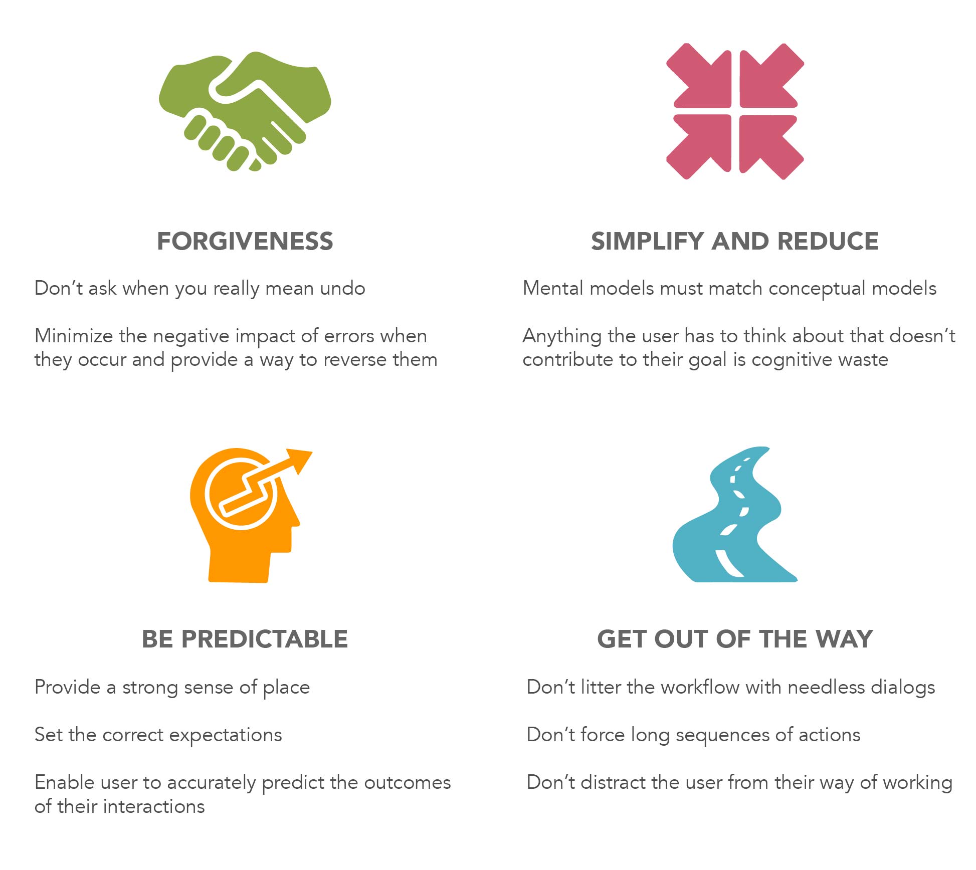
Some of my guiding principles for reimagining the workflow canvas were as follows:
WORKFLOW DESIGNER RE-IMAGINED
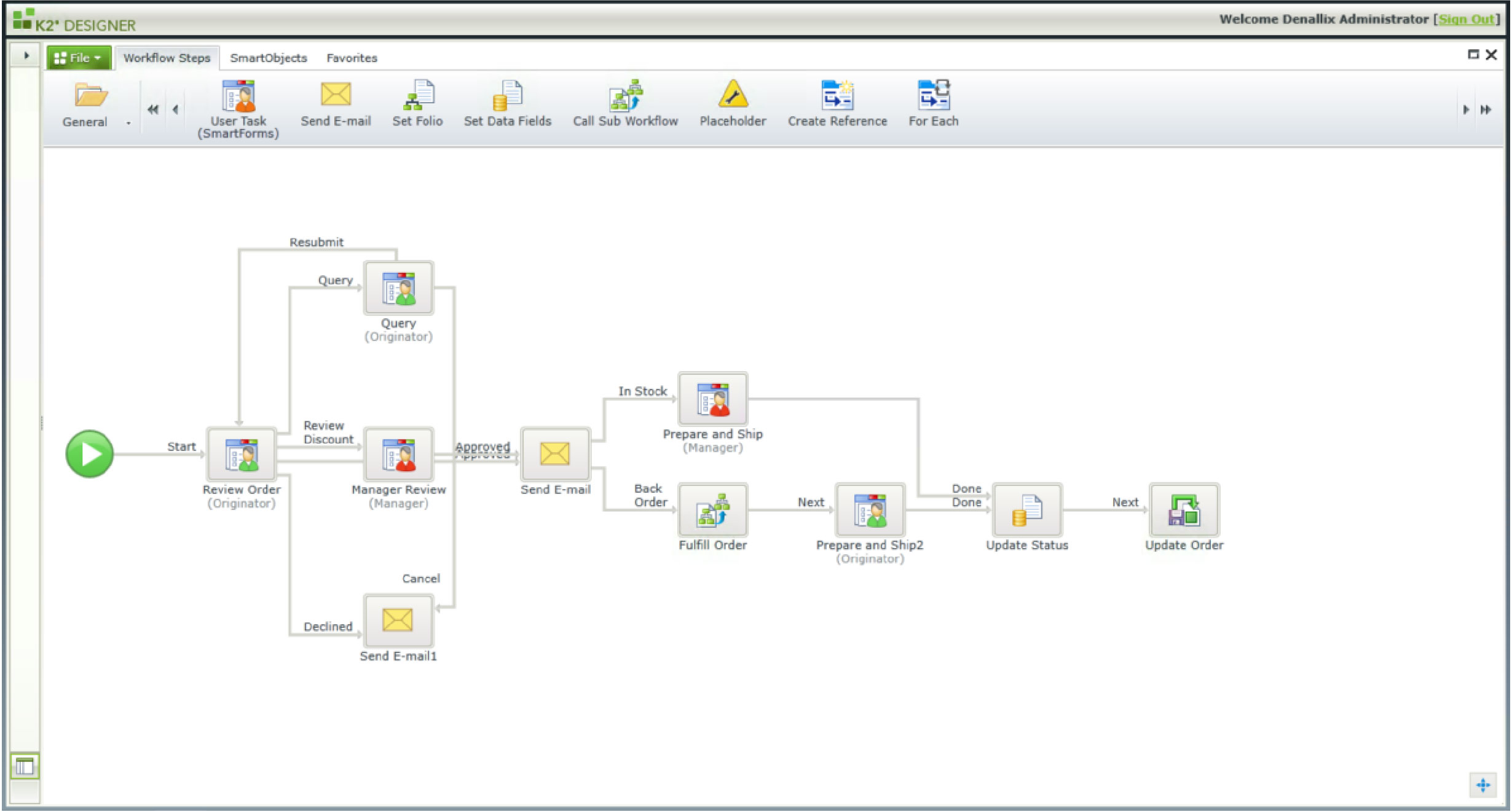
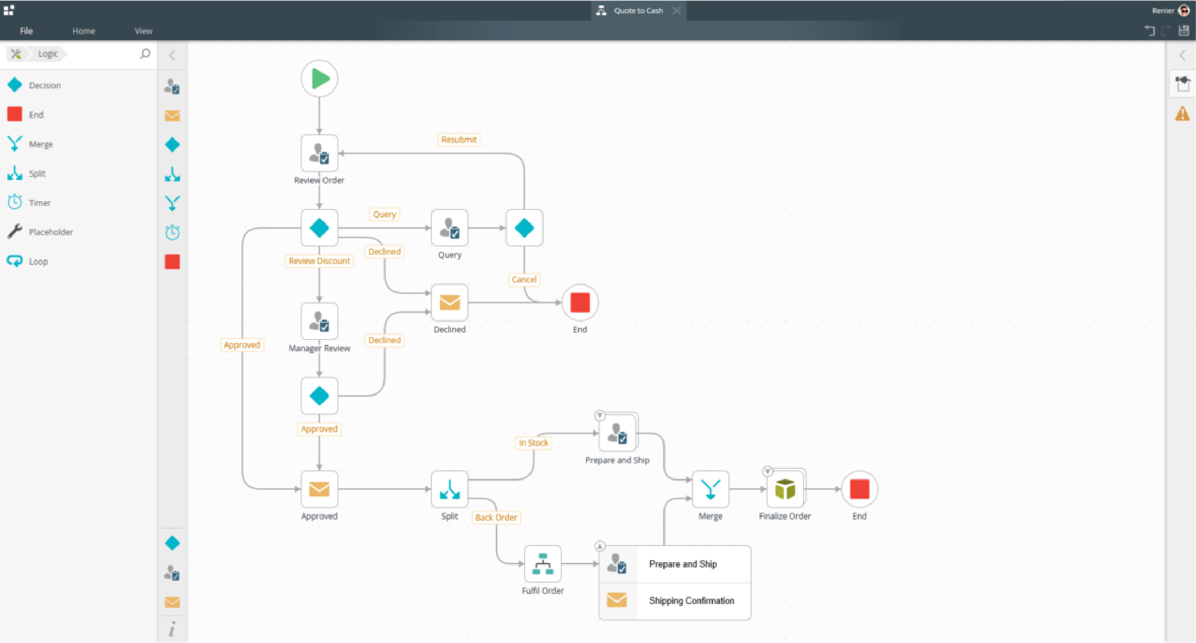
The application received not only a new look but also simplified and more intuitive functionality.
Before:
After: (with left panel opened)
MY PROCESS
USER TESTING
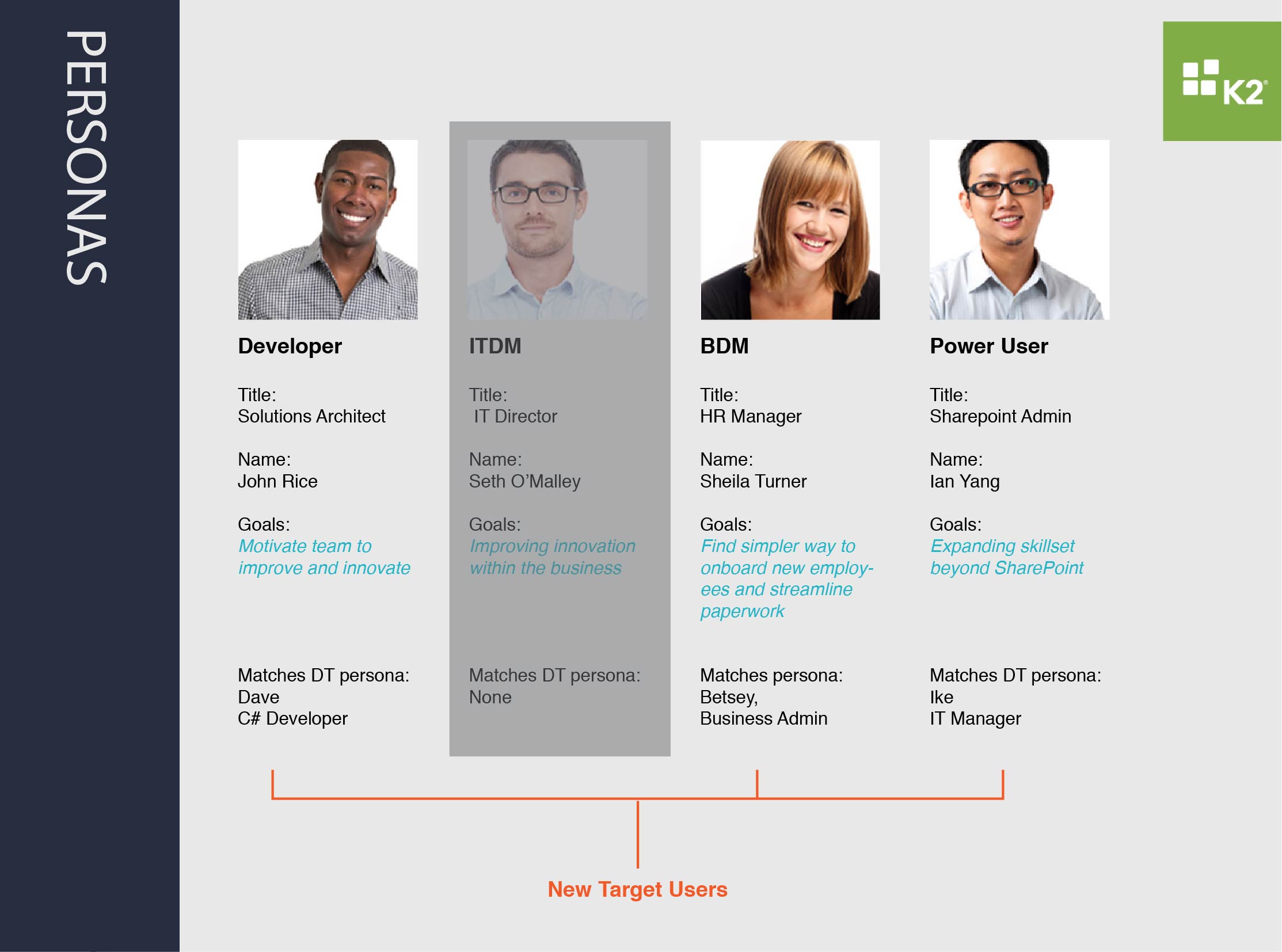
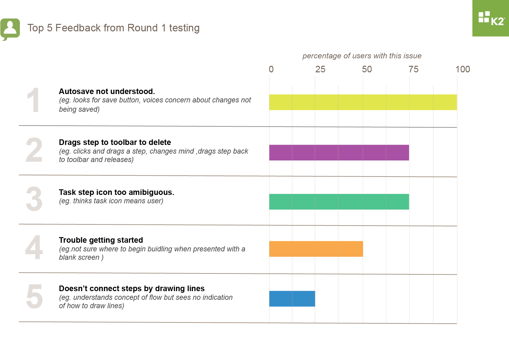
In order to understand the existing issues and craft elegant solutions, we first needed to find out where our biggest problem areas were. I helped create the company’s first user testing trials. Working closely with stakeholders, I first clarified our target personas.
I wrote screener questions to identify potential candidates, created tasks and wrote scripts for testing. I then crossed my fingers and presented a proposal to stakeholders for approval. My colleague and I conducted some of the intial tests, sitting with users and later reviewing video, noting issues and timestamps. When trying to make sense of the mountain of resulting feedback, I found simple data visualizations to be helpful in communicating findings across multiple teams.
After some discussions with the PM team, I helped to create recommendations for improvements and updates. In addition to overseeing in-house user-testing from end to end, I also collaborated closely with Blink, a local UX testing company, to create and run offsite tests.
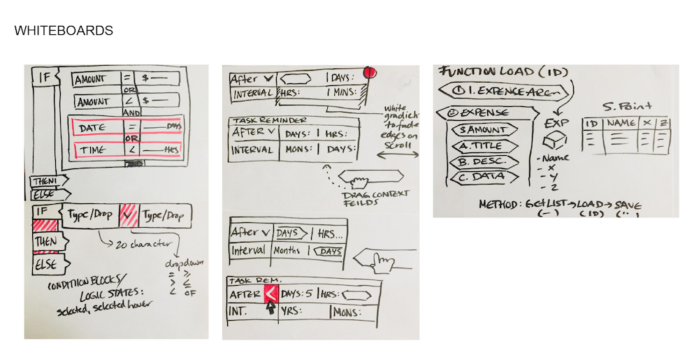
BRAINSTORMING
Once we had the facts, my colleagues and I would work together to discover opportunities to improve the product. The best solutions began with collaborative PM team brainstorming sessions at the whiteboard.
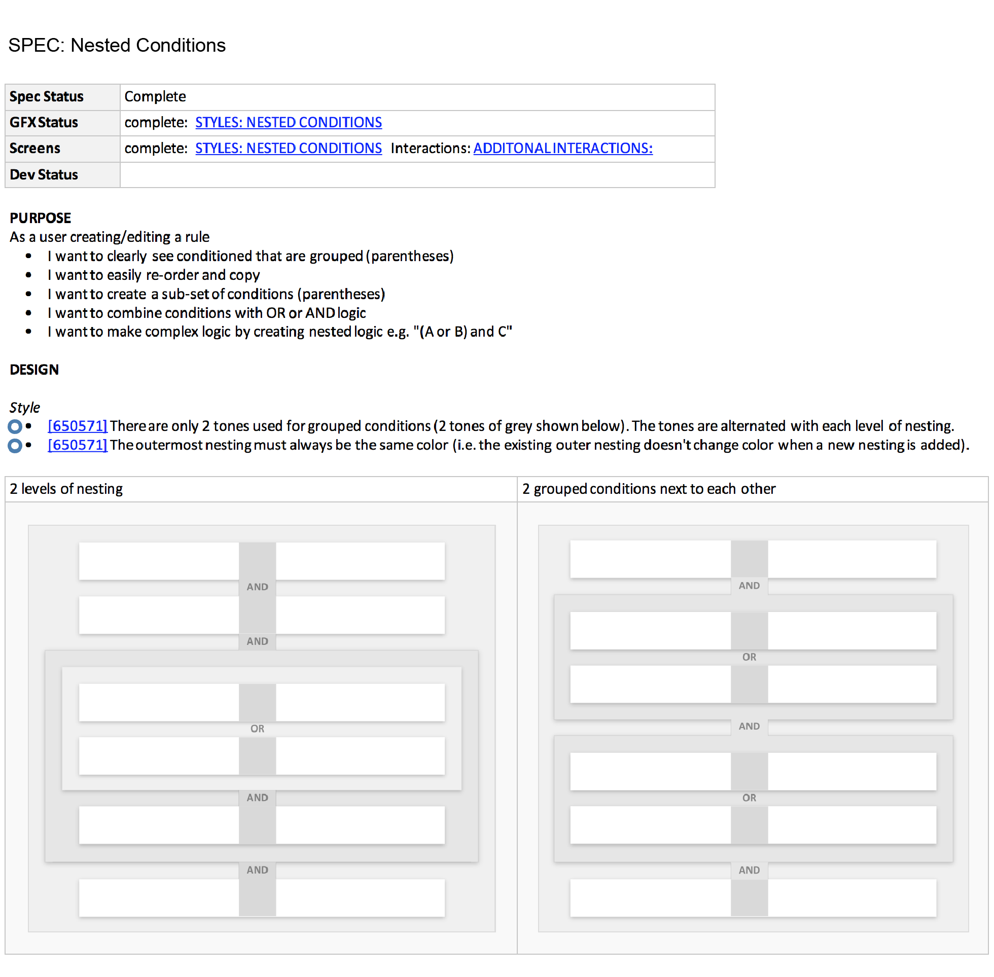
SPECS, WIREFRAMES AND VALUE PROPS
I often created detailed specifications with wireframes to kick off a story.
Rules Designer is an tool that allows the user to create custom business logic to direct the flow of the workflow. Here's the first page of a spec, where the goal was to create data visualization for layered and grouped conditions and logic within Rules designer:
See full version of below spec here.
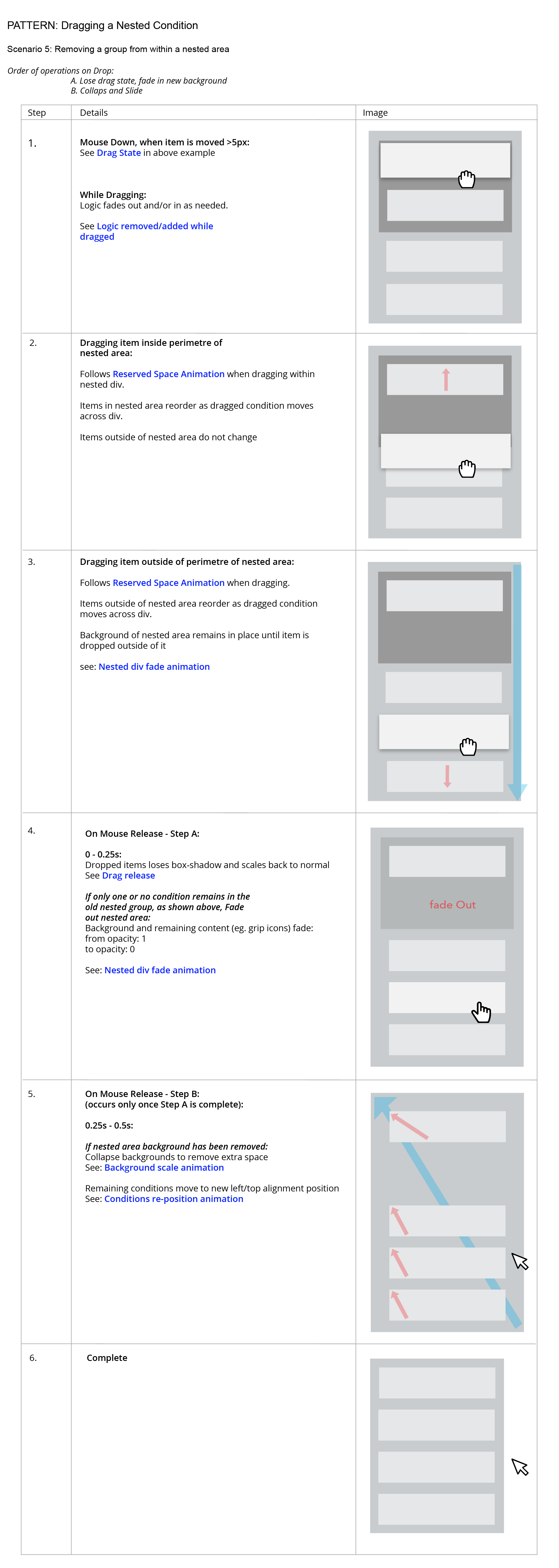
INTERACTION DESIGN
I wanted to create a standard set of interactions to be re-used across the product to ensure continuity. Here's an example of one of many patterns I created to illustrate the behavior of some draggable divs and their corresponding background divs.
Many stories required interaction design. Here is a walk through I showed to stakeholders to illustrate how a recycle bin might work inside a feature called Rules Designer.
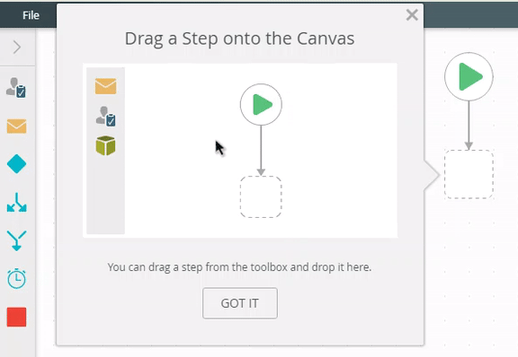
Other times, issues called for a more hands-on teaching approach to show the user how to complete an action. Data told us that new users often got stuck on the intial screen. Qualitative testing revealed that customers needed a hint to understand a draggable affordance. I suggested that we implement a Got-It type animation for first time users. We repeated this style across other helper animations in the product.
CSS PROTOTYPES
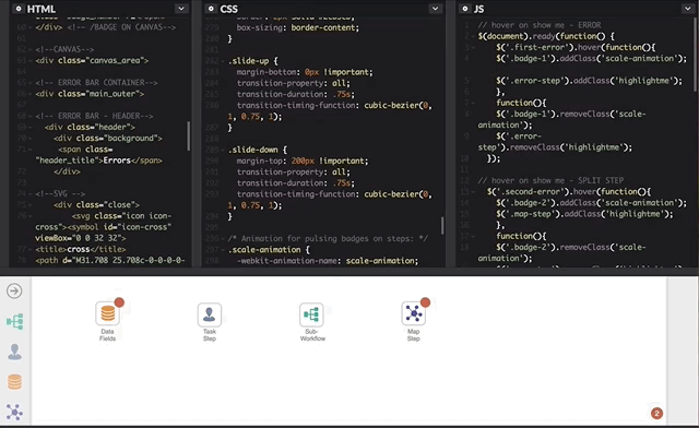
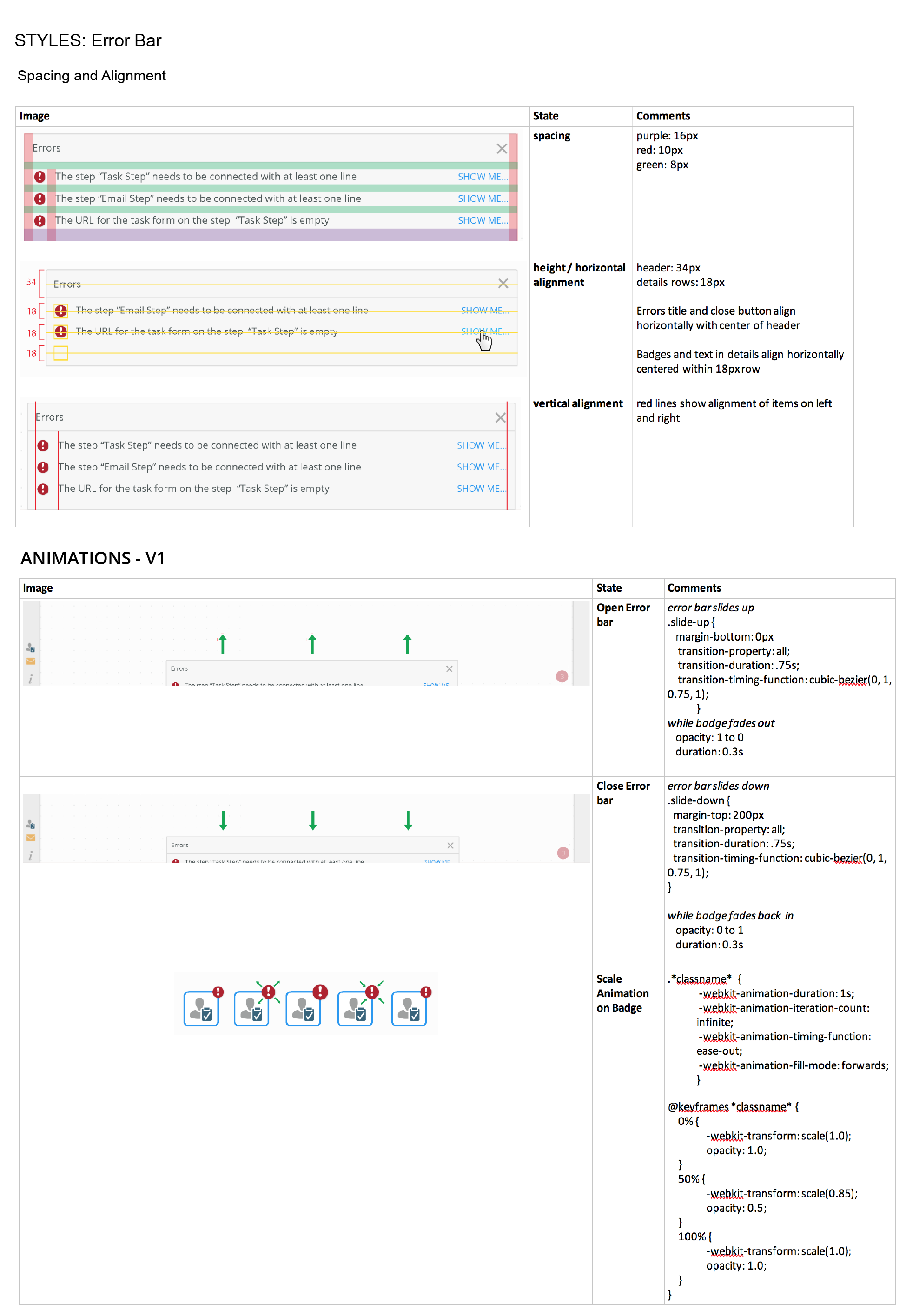
I often created CSS prototypes with Javascript or jQuery to test the functionality and timing of animations. Here's an item I created in order to test the visibility of corresponding errors. I also wanted to see the design live in order to get the slide transition of the error bar just right and ensure that the badge animations were effective. View project
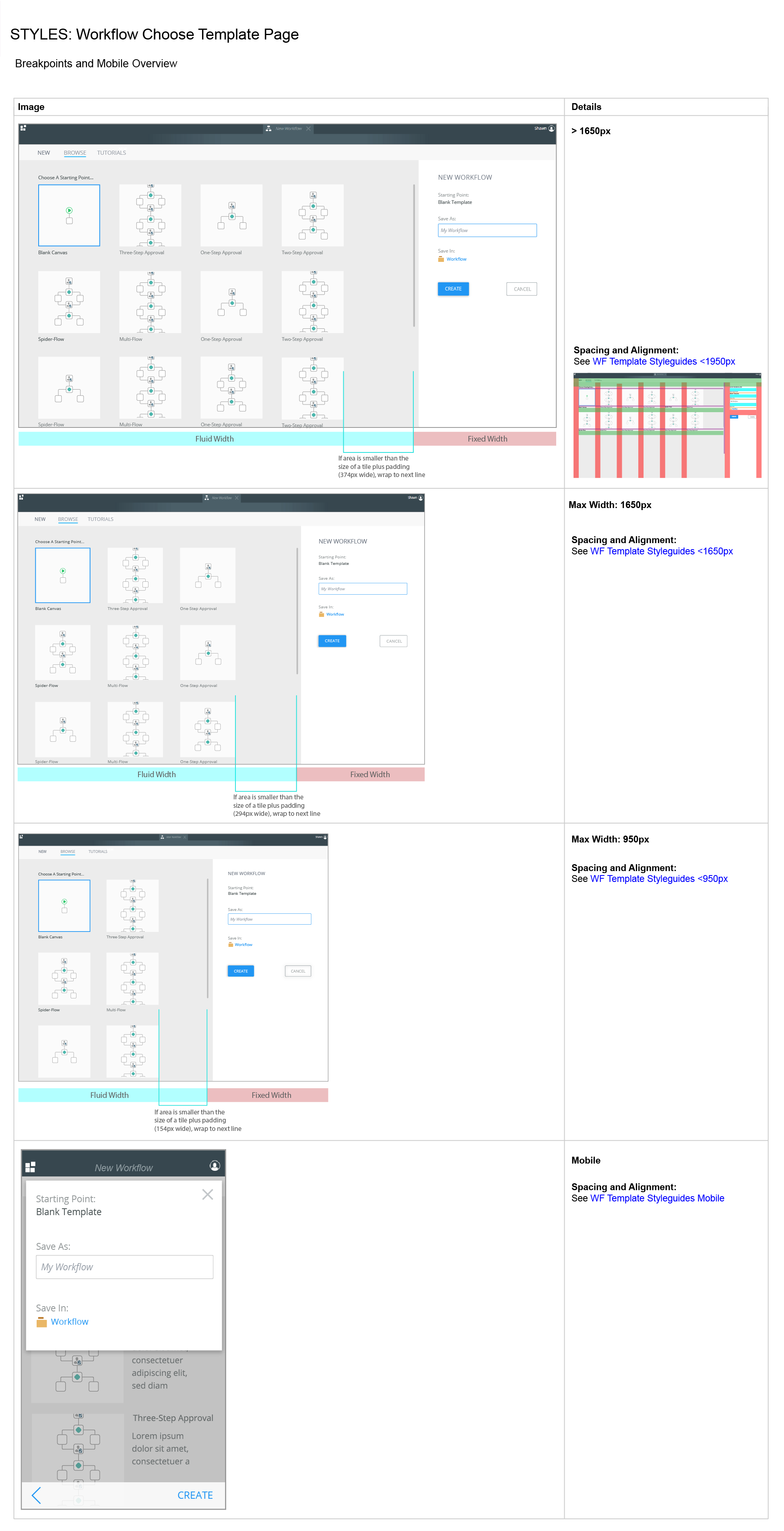
RESPONSIVE SCREENS and REDLINES
On many projects, I took the concept all the way to screens, completed guides for devs and QA.
This often included breakpoints:
CHALLENGE
Create an customizable IOT motorcycle helmet that improves user safety and enhances the riding experience.
SOLUTION
Through in-depth surveys, testing and research, discover what riders desire in a helmet and reveal where existing products fall short. Use cutting-edge technology to offer expansive features to improve the riding experience. Building upon user-test results, develop a natural user interface that is not only intuitive but simplifies a complex multitude of settings and backend function.
RESEARCH
This was a research-heavy project wherein I had to familiarize myself with technology such as augmented reality(AR), natural language UI, and regulations for heads-up display (HUD). I was fortunate to have the help of a partner, Zian Dinh, for the discovery process. Data was gathered by means of an online survey and used to triage device function. I examined the competition, taking note of the limitations and capabilities of existing products and studied similar products such as Google Glass, Occulus Rift and HoloLens.
CONCEPT + ORGANIZATION
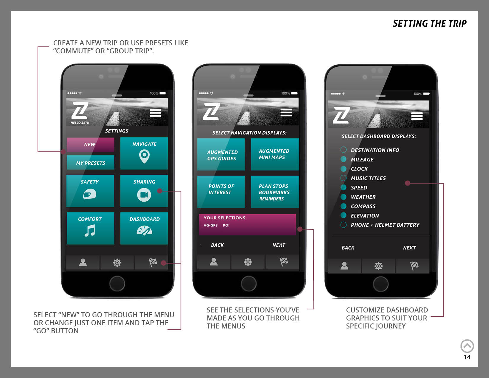
On the whiteboard a taskflow for a typical ride was established, starting with customizing display settings in the app followed by interacting with the HUD. These steps were tested and re-iterated several times in order ensure that front end information architecture was organized and succinct.
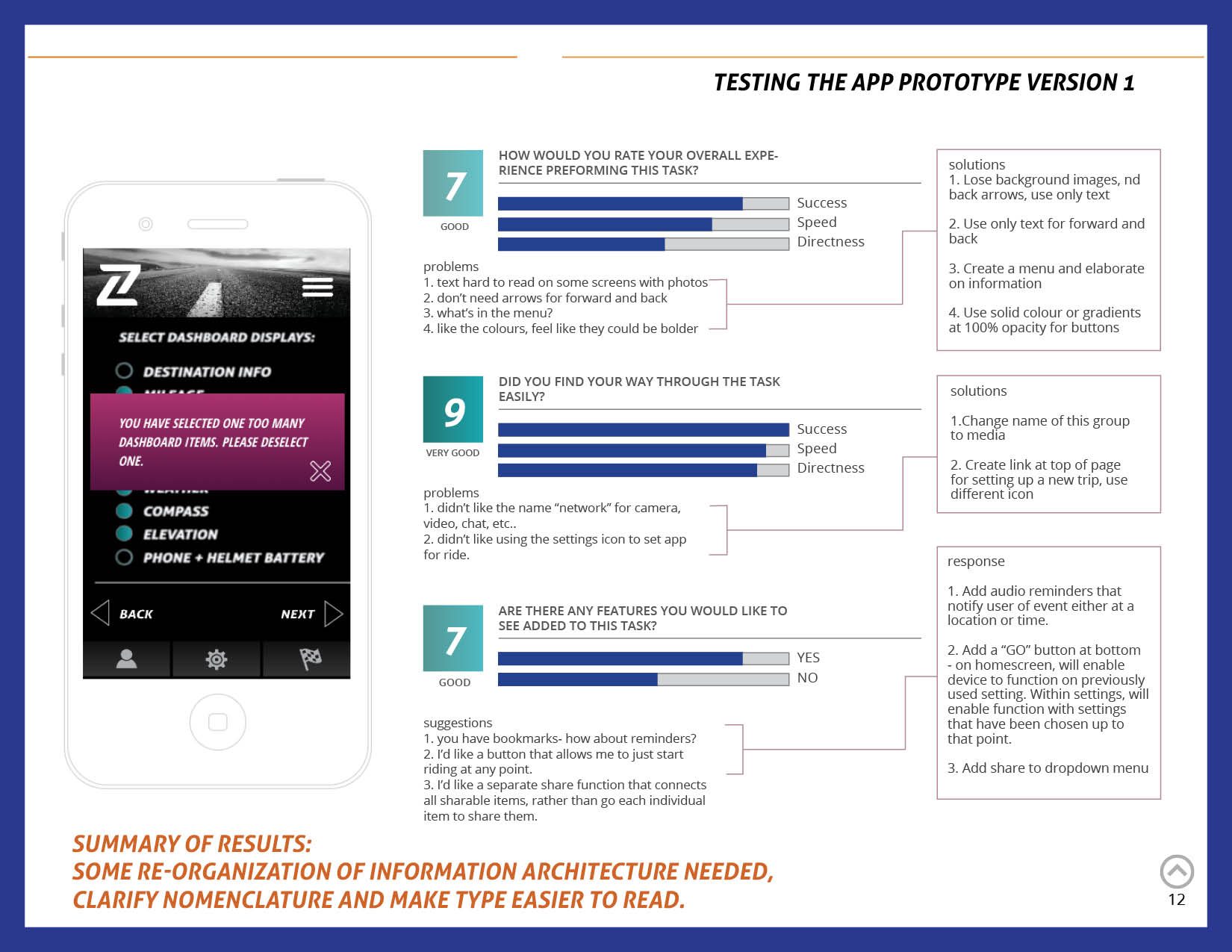
DESIGNING + TESTING THE APP
The app went through several iterations as it was tested. A card-sort, in addition to user-feedback, allowed for intuitive classification and hierarchy.
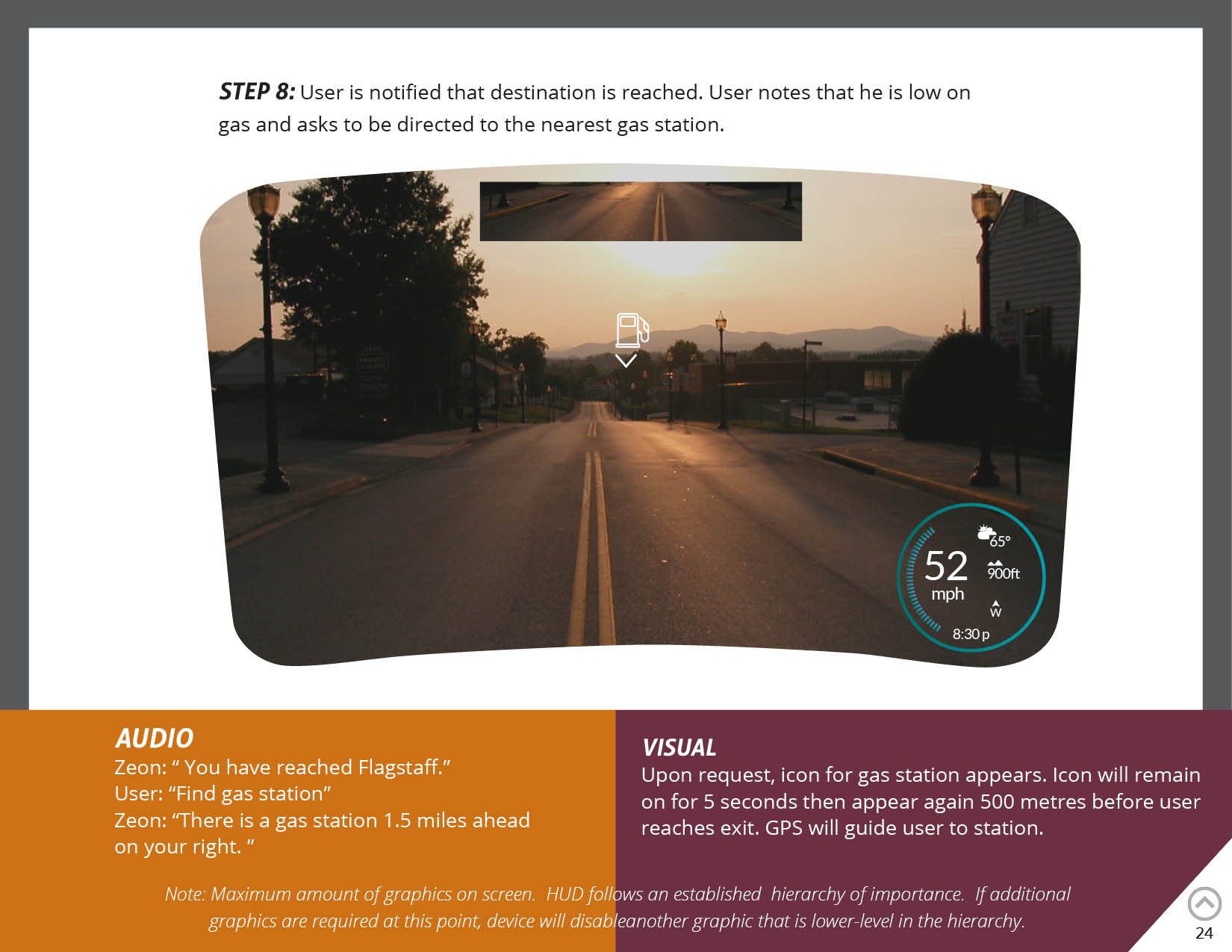
DESIGNING + TESTING THE HUD
Safety standards are paramount and were considered at every step of of the design process. After testing both audio and visual components, a simple, elegant solution was created.
REFINING THE EXPERIENCE
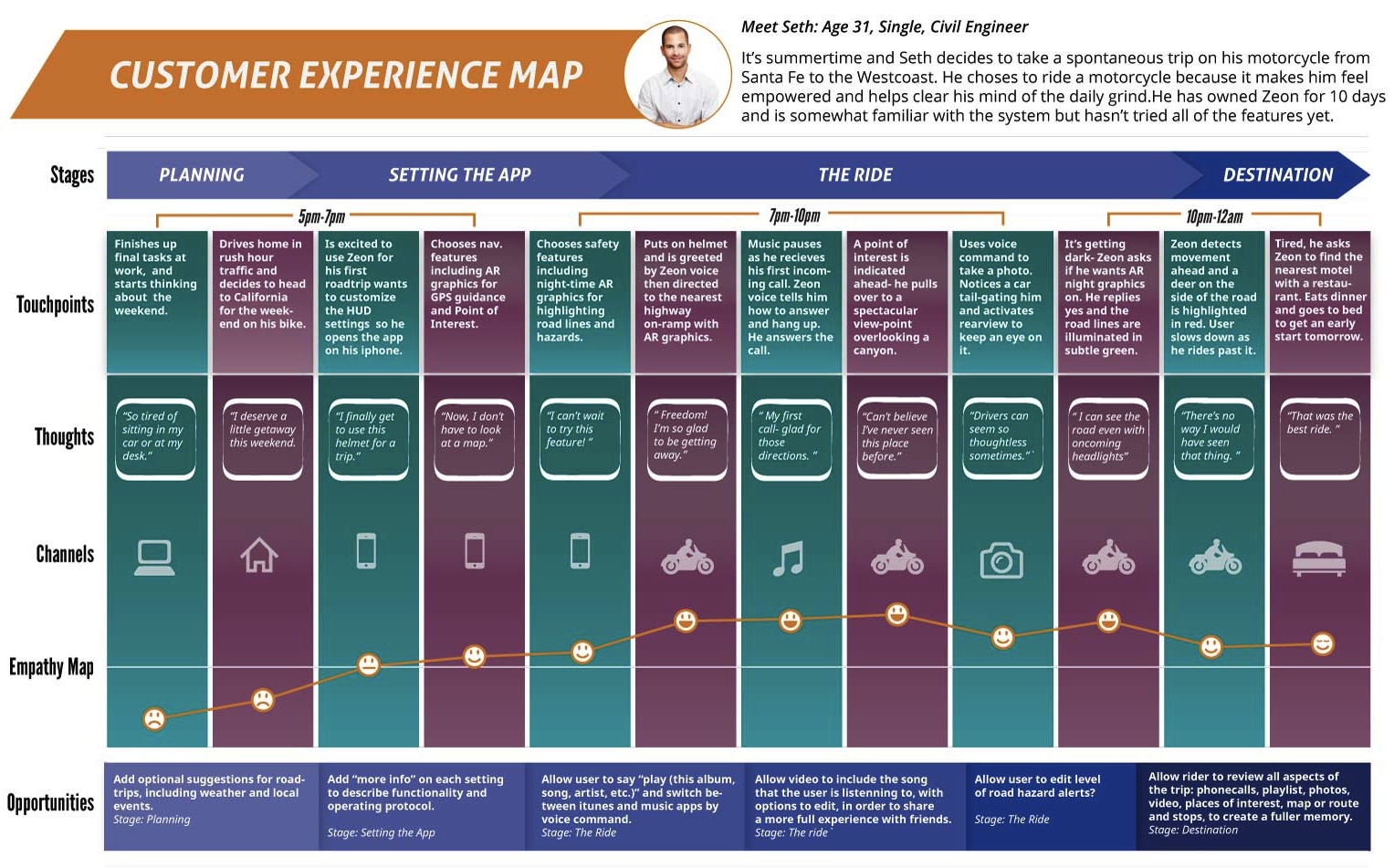
To get a deeper understanding of the gestault of the product and disocver opportunities, I created a customer experience map, including touchpoints, thoughts, channels and empathy graph.
SELLING THE IDEA
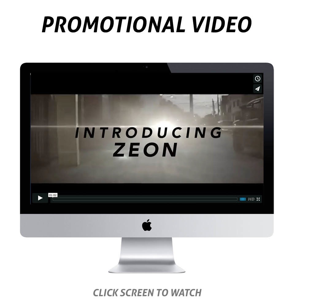
In order to pitch the final product, I created a promotional video as well as marketing materials, including branded accessories, packaging and diagrams that outline product specs.
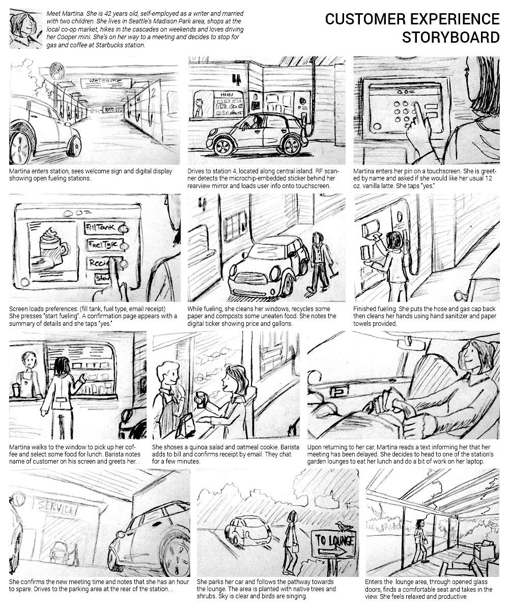
My Role: Competitor and user research, visual design, storyboarding, user testing, station design and experience.
Challenge: Work with a partner to solve the problem of creating a better gas station experience and integrate this concept to an existing company. Project duration: 2 weeks
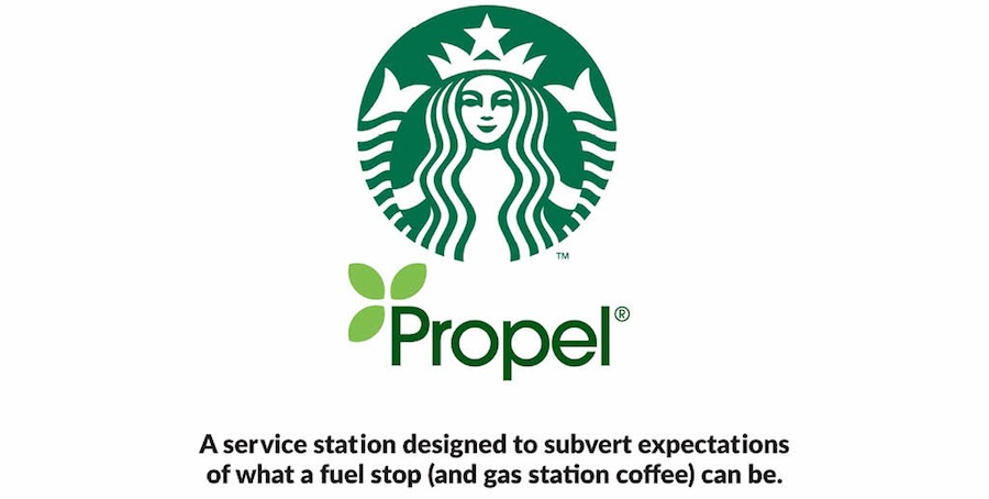
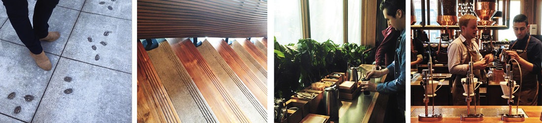
Solution: Sarita and I began researching existing companies to find one that could plausibly lend itself to an improved fueling experience. We then investigated further to see if any companies had ever attempted this improvement, and seemingly, nobody had. Within the throes of a brainstorming session, I playfully suggested a Starbucks-gas station hybrid. The more we thought about it, the more it made sense. We settled on Propel Fuels as an appropriate partner- a green(er) fuel company that provides alternative fuels in addition to standard fuel. Keeping in mind the existing brand characteristics of Starbucks, we set out to create a credible marketing twist for both companies.
INSPIRATION AND CONCEPT
We made a trip to the new Starbucks Reserve shop on Pike Street and took a short tour for inspiration. We scribbled down a caucophony of ideas and touchpoints. We then conducted an analysis to determine what typical users dislike about the standard service station experience.
ADHERING TO BRAND STANDARDS
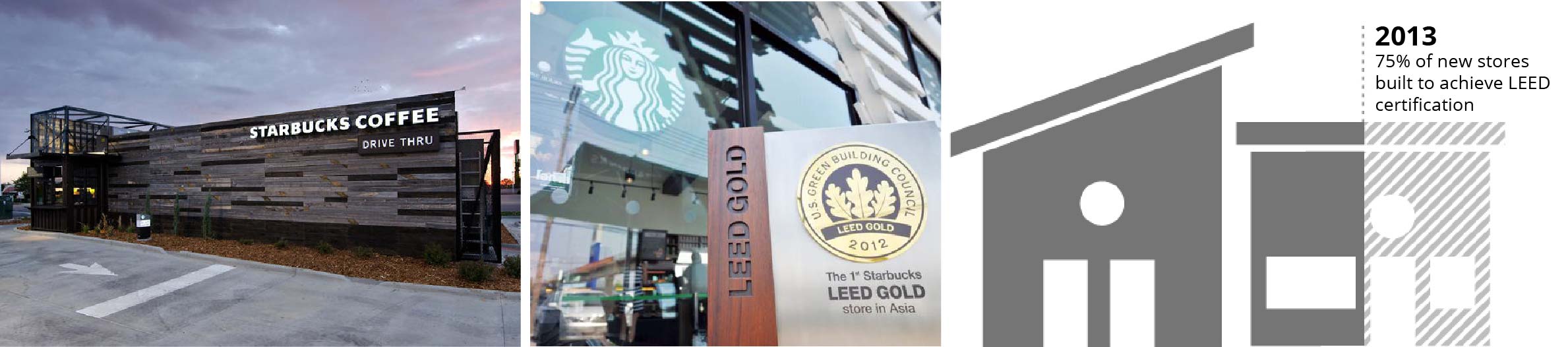
We spent a considerable amount of time learning about Starbucks' brand positioning and unique selling proposition as well as the company's latest minimum-footprint cafes and it's advances towards LEED-certified construction. These standards would guide us throughout the design process.
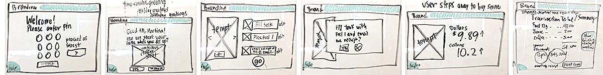
DESIGNING THE INTERFACE
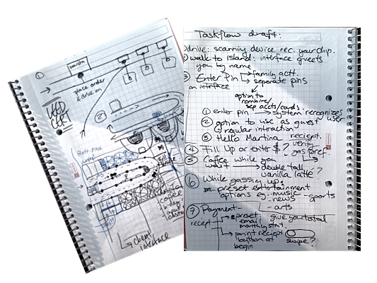
On the whiteboard, we worked out the flow of the fueling station interface, carefully considering the customers' needs and business' goals before translating the taskflow into visual design.
CREATING AN EXPERIENCE
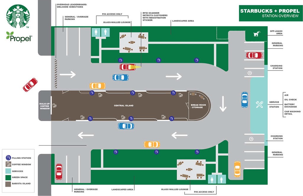
I illustrated a taskflow storyboard, to help communicate to stakeholders our complete vision. The process allowed me to discover more opportunities to improve the customer experience which were subsequently added into the project. One such finding was the need for a leaderboard that shows customers which fueling stations are open on the opposite side of the central island.
TWO SIDES OF THE STORY
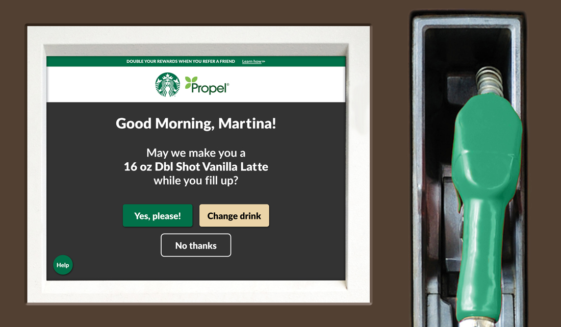
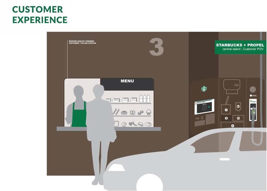
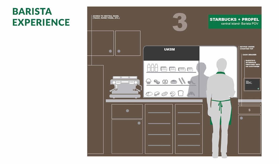
Extensive user feedback helped us to find opportunities to improve and expand on the experience of both the customer and barista. On the customer's side, we slightly recessed the fuel-pumping station to create separation from the barista window. An overhead boom provides access to a retractable fuel line, allowing users to reach either side of their car.
We made sure that all fueling station supplies could be restocked, frequently and easily from compartments inside. We also added a touchscreen that shows the barista information on the customer such as name and preferences, enabling them to have a more personable interaction with the user.
BIRDS EYE VIEW
We incorporated two glass-enclosed lounges and green areas landscaped with native plants on either side of the station, a place where customers can meet friends, prepare for meetings or relax and have lunch. The facility also includes charging stations for electric cars, a carwashing area that utilizes recycled stormwater from the roofs, an off-leash area and a walk-up coffee window to extend services to pedestrians.
Challenge: My client, a mechanical engineer, has a unique idea for a bar and needs branding, experience design and app design. The establishment focuses on providing inexpensive drinks and quick service by way of automating the drink production process and utilizing the app for ordering and payment.
Solution: Determine basic functions, taskflows and features with client. Organize information architecture and test simple prototype for app, reiterating and retesting throughout the design process.
BRAINSTORMING CONTENT ARCHITECTURE
Working out the organization and taskflow with pencils and pixels.
ESTABLISHING A LOOK + FEEL
My client wanted a bold logo with a slight vintage-feel reminiscent of the comics, propaganda posters and aviation livery. I tempered the strong masculine branding with a subdued and multi-colored palette and added CAD-inspired graphics as a nod to the clients' engineering roots.
PROTOTYPE FEATURES *Please note that this section is currently being revised
Iteration 1:
Iteration 2:
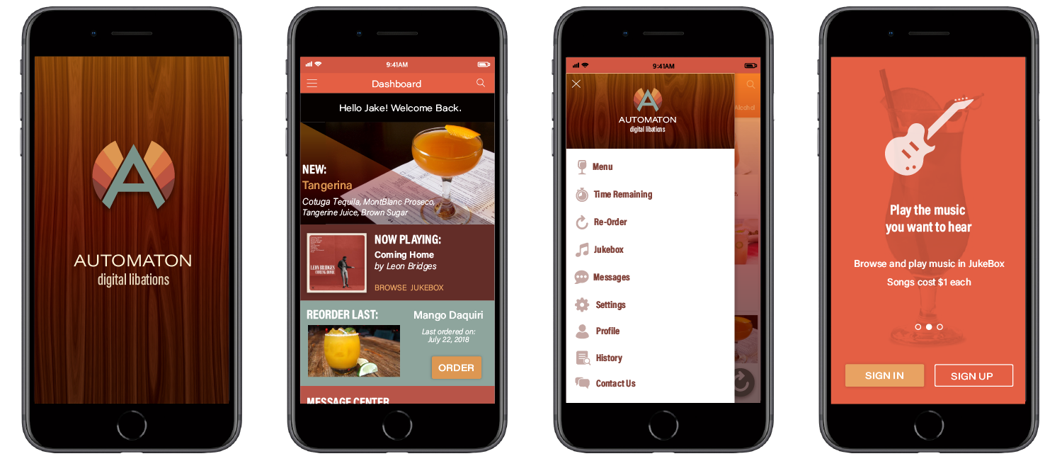
Load Screen, Home, Main Menu and Sign Up Details: The homescreen recieved a complete redesign and is now more engaging. It highlights the three main experiences: drinking, socializing and playing music. A hamburger menu was added to give users easier access to all features. A quick re-order button shows the user what they ordered last and allows them to order another with two clicks. An introductory walk-through introduces users to value propositions.
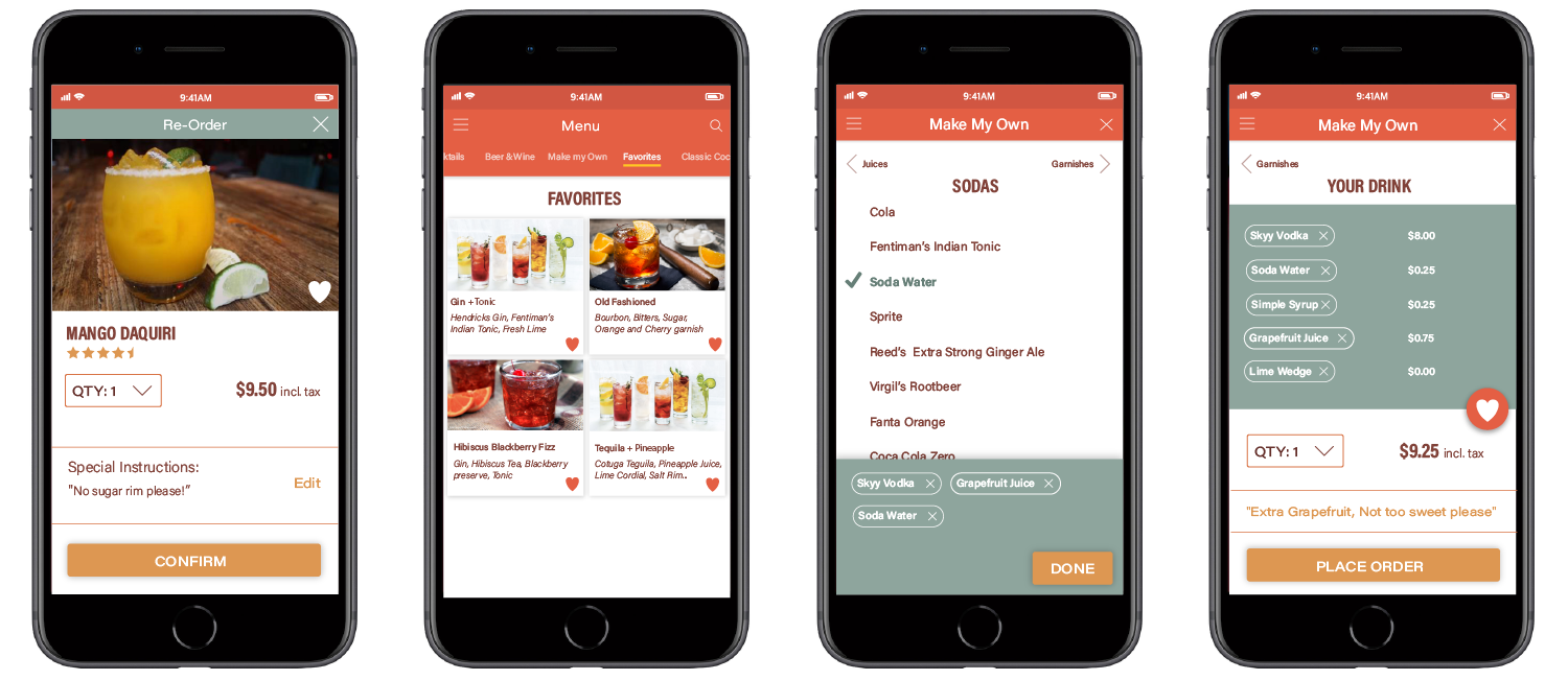
Menu Sample Pages and Order Confirmations Details: Photos of drinks were added to create stronger appeal to users because studies show that images have a dramatic effect on conversion rates in the food industry. A like button as added to the drink detail page so that users can easily add or remove items in their favourites list. Estimated wait time was added to the order confirmation page and a QR code was added to the pick-up alert.
Re-Ordering, Favourites and Customization The re-order page is a simplified version of the drinks detail page above. It has all the same functionality minus details no longer relevant to a repeat order. An editable favourites list was aded to the menu as bar patrons often order the same drinks. The custom drink pages were simplified, with an editable breadcrumb list at the bottom of the page that allows the user to skip ahead to the order confirmation page at any time.
JukeBox Feature, Socializing with other Patrons and Messaging The jukebox is an online menu of curated music that users can browse and play music from. It might be fun to add the user's alias to the "now playing" sections. I also spent a lot of time researching the social element of this app. One idea was to allow the user to go public and be available for chatting with other patrons. We may also add a beacon button that flashes a bright screen so that users can find each other.
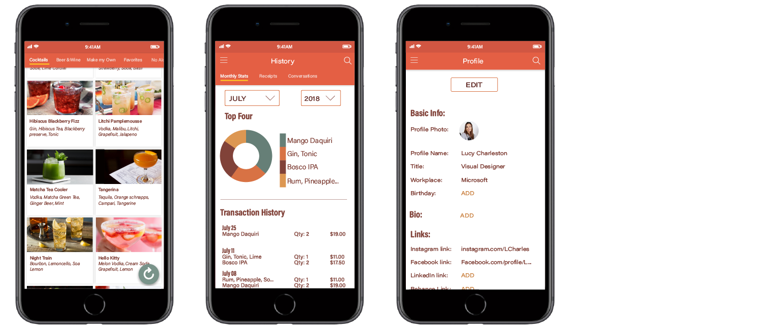
Collapsible header, History and Profile The top menu collapses to maximize horizontal real estate when user scrolls down. History allows the user to look up past orders and bring up receipts for expense reporting. The user can set up a profile with banking details for automatic payment.
Next Steps - moving forward from Iteration 2
Complete current prototype in InVision
Review with peers and stakeholder
Revisit established personas
Revisit red routes and use these to create tasks for user testing
Test for accessibility issues; how do users under the influence of alchol interact with the app?
My Role: User research, competitor analysis, user testing, gameplay conception, creation of characters and visuals, executing game prototype in Axure.
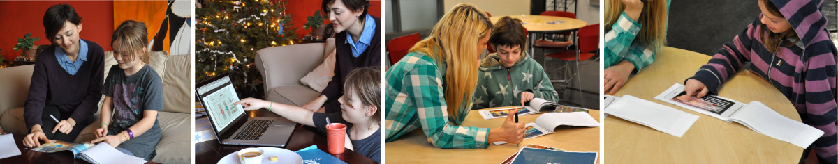
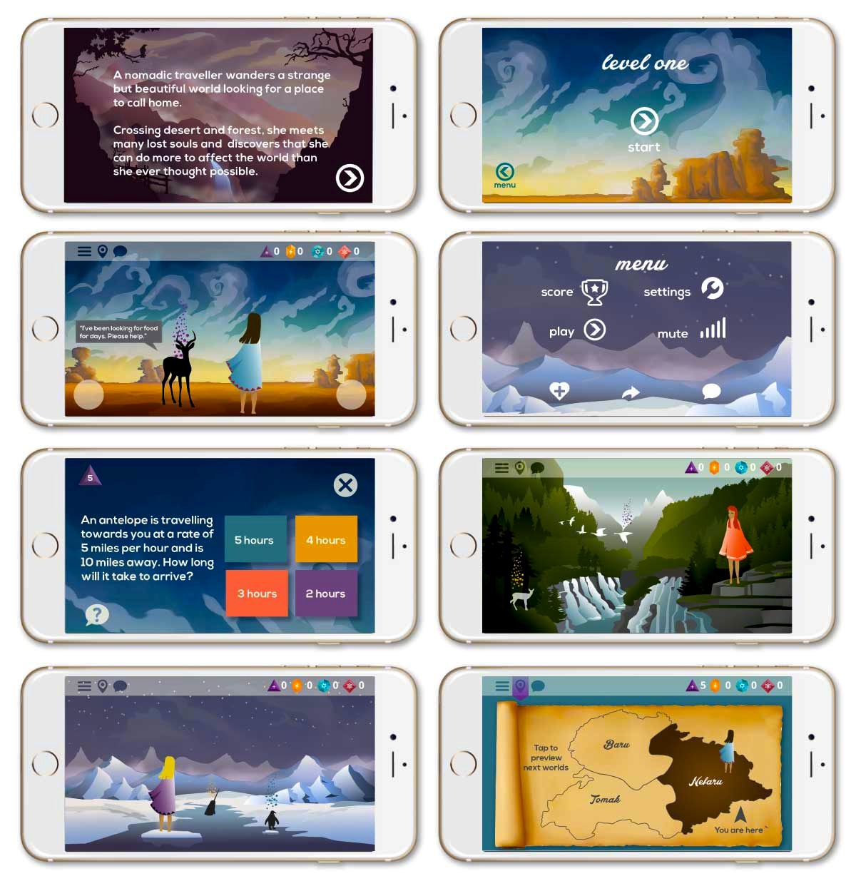
Challenge: Create an educational app for girls aged 9-11 that makes learning STEM subjects (Science, Technology, Engineering and Math) habitual and entertaining.
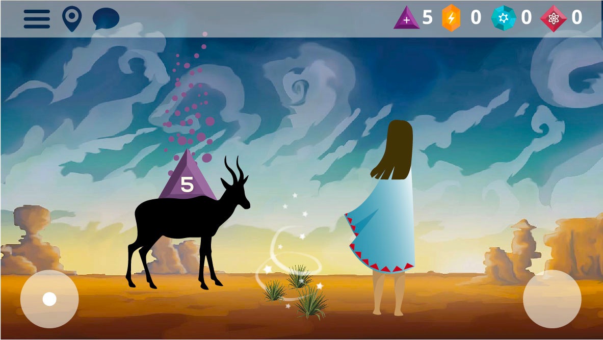
Solution: Together with my project collaborators, Dyan and Erika , we decided early on that we wanted to create a compelling game concept that focuses on the user's natural tendancies. While the premise is typical, to earn enough points to move to subsequent realms, what makes this game unique is a double reward system wherein both the player and the characters she interacts with are rewarded. Studies show that girls in this age range have a strong inclination towards nurturing and building, thus we designed the gameplay around helping characters by answering STEM-themed questions. Each world will have a new set of landscapes and characters with distinct needs.
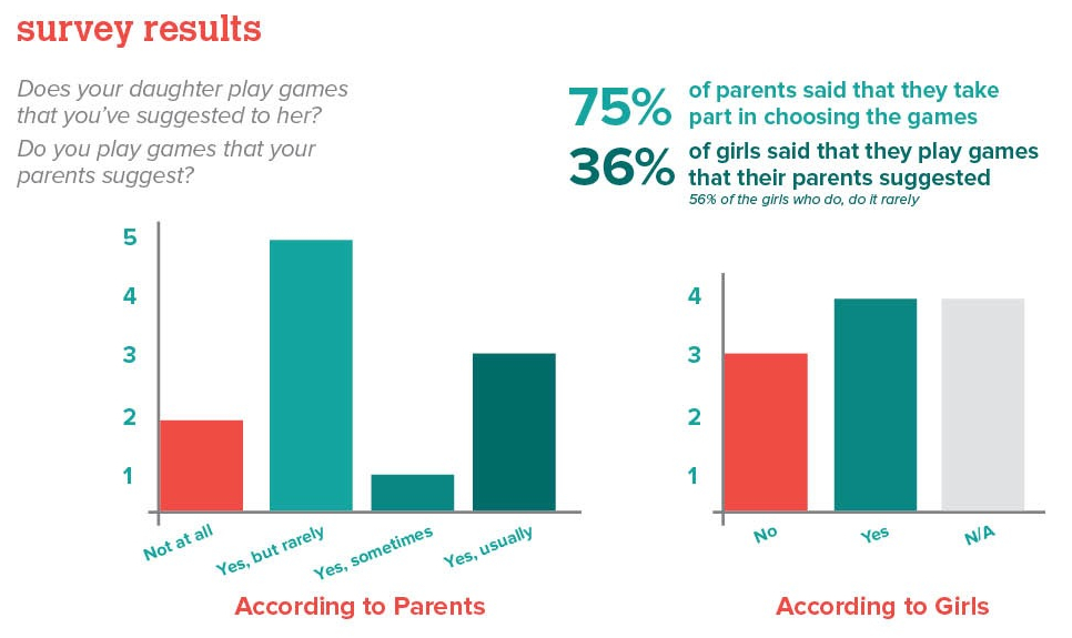
RESEARCHING OUR USERS AND THE COMPETITION
We began by studying what inspires girls these days by conducting an online survey for both parents and their daughters. Results revealed many clues and interesting discepancies between what the parents thought their girls wanted vrs. what the girls actually wanted. Additionally, we researched our competition taking careful note of what was working and what wasn't in similar games.
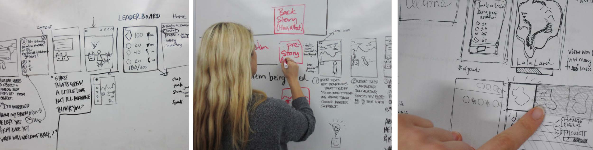
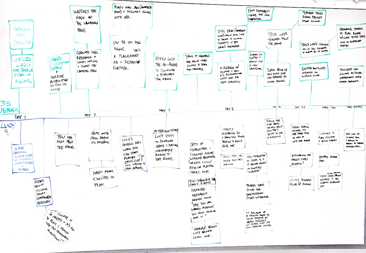
CREATING A GAME CONCEPT AND EMPATHY MAP
After pinpointing the user's needs, we spent a lot of time at the whiteboard contemplating one another's ideas, scrapping many and incorporating others. Once we were headed in a viable direction, we moved on to taskflows and empathy mapping.
SOCIAL INTERACTION ELEMENTS
Because this user group is strongly influenced and motivated by their peers, we wanted to include a social aspect within the game to create a community of players and advocates. We built wireframes for inviting friends, in-game chatting and a barter system that allows girls to trade points with friends.
TESTING PROTOTYPE ITERATIONS
We discovered that girls in this age group are much more tech-savvy and wise than we were giving them credit for. One commented that she "didn't like the font" we had used in an early version of the prototype. Another advised that we had an extra step in the game taskflow that was uneccessary. Excellent feedback from our users helped us to simplify the flow and ensure that we were on target for our persona's age group.
FINAL DESIGN
The final design includes elaborate graphics and an engaging storyline, two factors that are essential for player retention according to both our users, as well as studies conducted by gaming companies.
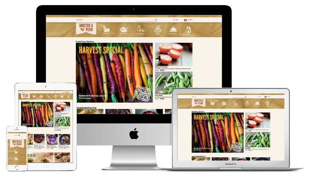
My Role: User and competitor research, logo and visual elements, web design, imagery style, customer experience map
Project Scope: Create and improve the Community Supported Agriculture (CSA) concept to attract more long-term customers. Working in a team of two, we had one week to go from concept to screens
Solution: My partner Michelle
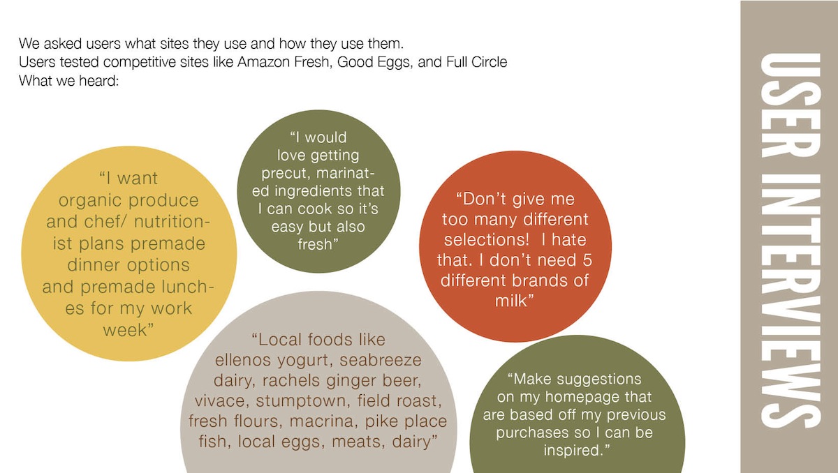
and I started this sprint by researching other companies and researching multiple users. We found that the typical user who would utilize this service falls in a higher income bracket and wants more than just produce. They want the best of all worlds, from the quality farm-fresh produce of Helsing Junction to organic fresh semi-prepared meals created by local chefs. We responded by providing a hybrid combination of the standard CSA, meal delivery service and grocery delivery in a curated selection that is delivered to user's homes at a time-frame of their chosing.
SIZING UP THE COMPETITION We interviewed existing users of these businesses and took note of what they liked and didn't like about each.
CREATING USER PERSONAS Two personas were created based on combined characteristics of our users.
EMPATHISING WITH THE CUSTOMER I created an in-depth customer experience map which revealed further opportunities to improve the experience.
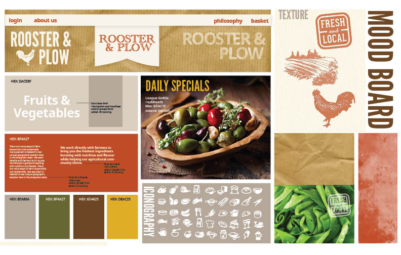
LOOK + FEEL Next I went to work creating brand characteristics to match our user's tastes
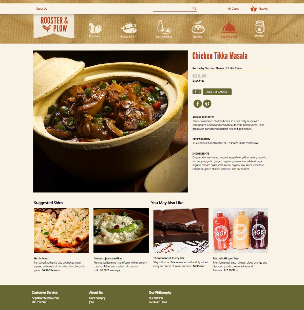
WEB DESIGN I created a layout for the structure of the site, which was then wireframed, tested and reorganised. Michelle coded two pages with content, which we tested again before arriving at our final design.
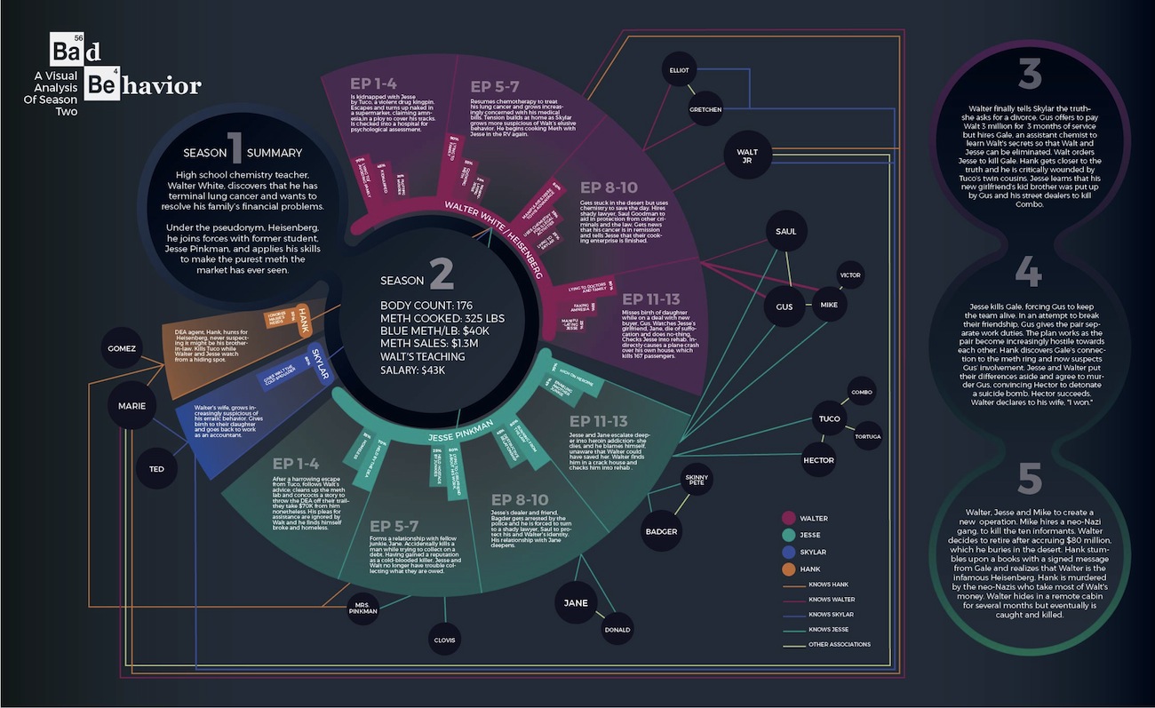
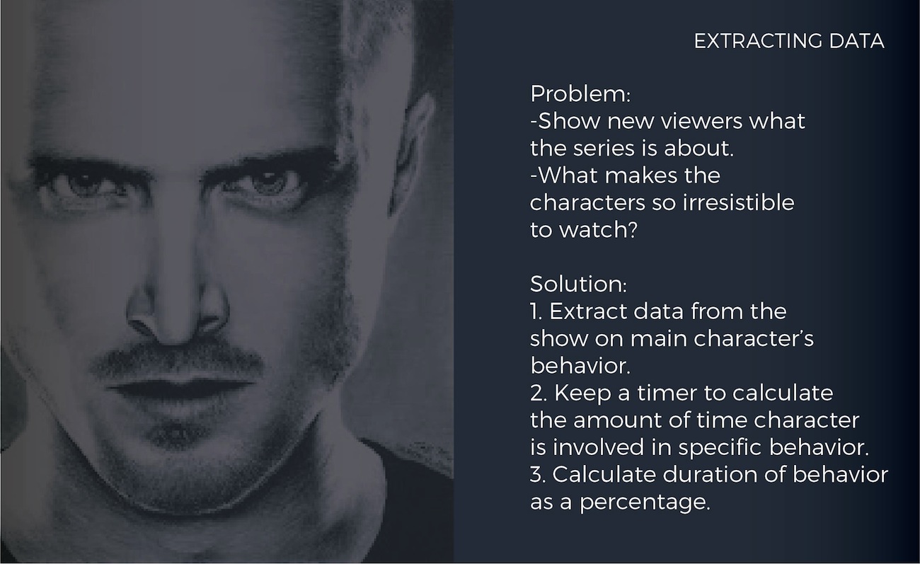
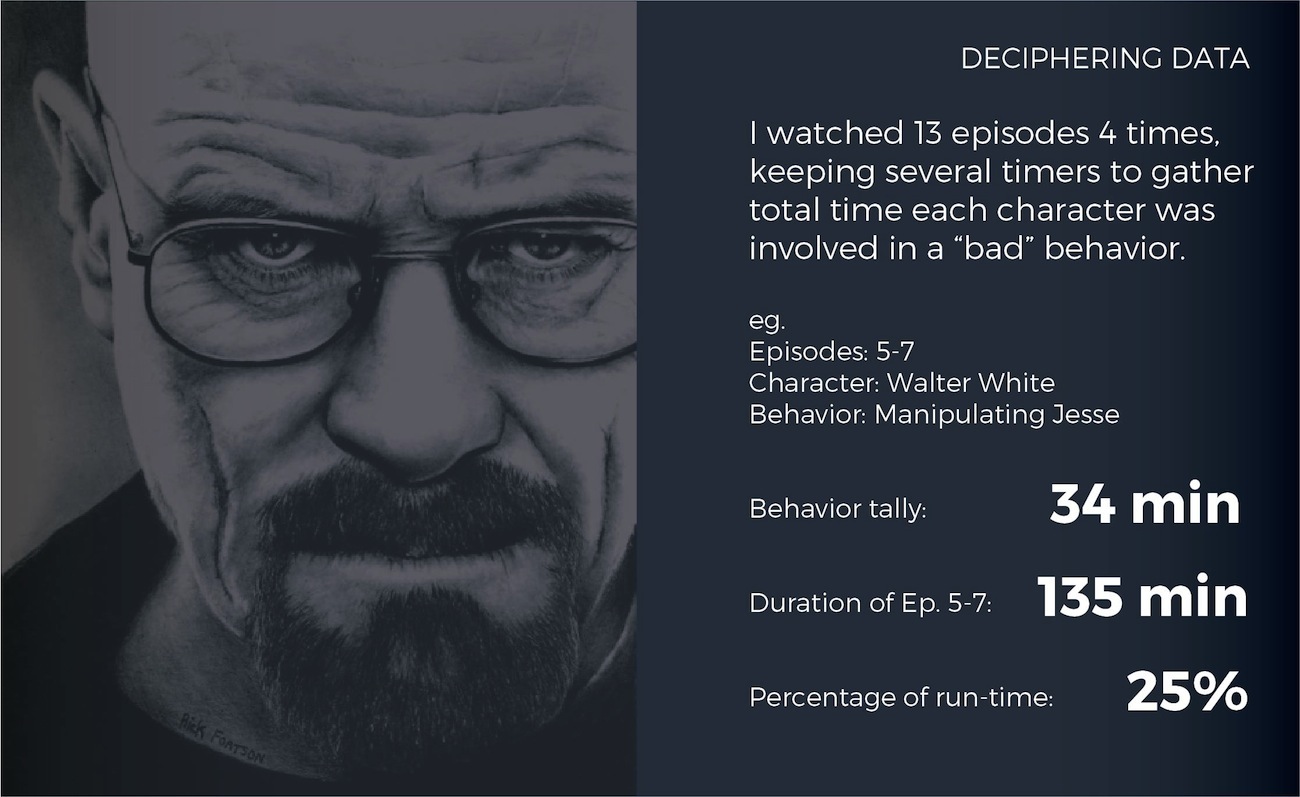
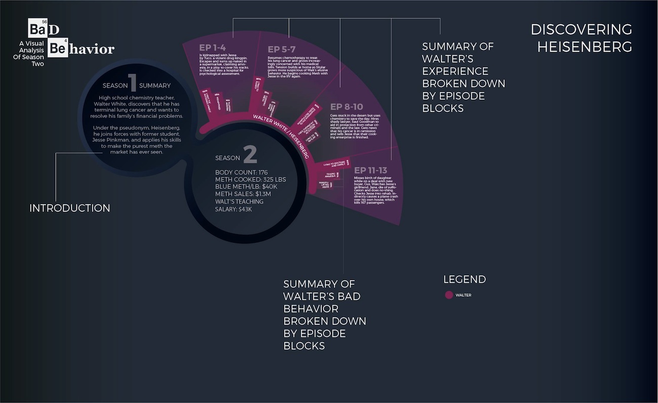
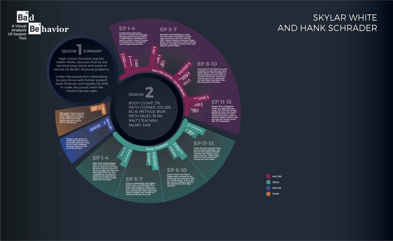
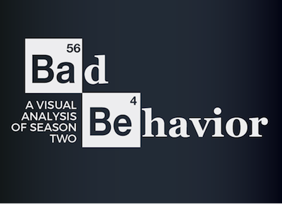
Breaking Bad Data Visualization
Analyzing bad behavior amongst the series' key characters.
Challenge: Find a visual solution to show a new viewer the premise of the entire series. I was required to provide enough information so that the viewer can speak about the show to other viewers as though they had actually watched the series.
Solution: I wanted to emphasize the show's reliance on the anti-hero in it's character profiles as well as show the relationships between characters. To give the viewer a deeper understanding of the personalities of the key characters, I focused on season 2 and chose to summarize the other seasons in a breif paragraph.
Rebranding Kenmore Air
A comprehensive rebranding project.
Project Scope:
Logo and Graphic Elements
Branding Guide
Marketing Materials
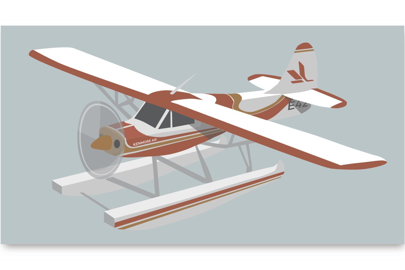
Aircraft Livery
Uniform design
Mockup for waiting area
Desktop and Mobile Homepage
Interactive Screen Design
User Testing
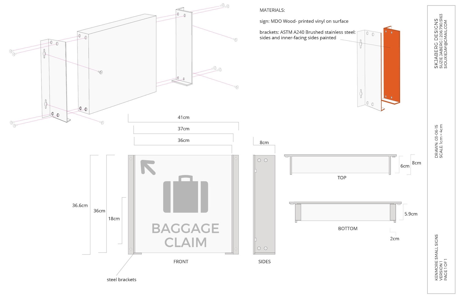
Signage for terminal, with spec sheets
Challenge: Bring a well-established avaition company up to date while remaining concurrent with the existing brand character.
Solution: I created a fresh new look for Kenmore, pulling from the company's brand position and history.
RESEARCH
In order to understand the company character and brand characteristics, I looked closely at Kenmore's history, the background of the founders and services they offer. I asked several users about their experience and expectations of the company. Kenmore's competitors provided a valuable look at what customers expect from this type of business.
CREATING A NEW LOOK
I collected imagery and created a colour pallette, selected typography and created graphic elements. I chose a clean tertiary americana-inspired palette to reflect the founders' affiliation with the airforce and added wood elements to bring warmth to the look. Using a modern, easy to read sans serif brought the look and feel up to date while vintage touches speak to a more romantic time in aviation history.
ESTABLISHING GUIDELINES
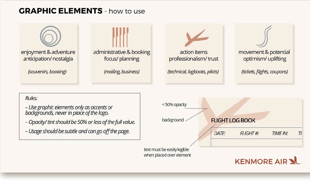
In order to successfully pass off the package to future designers and developers, I created guidelines for the logo and graphic elements. I used vintage photos from the moodboard to create graphic elements and established terms of usage to help maintain consistency across the brand character.
SIGNAGE AND SPECS
In order to execute a signage system that communicates information intuitively and consistently, I used the same typefaces as the branding materials as well as internationally-recognized icons. Detailed spec sheets were added to communicate the needs of the client to the manufacturer.
INTERACTIVE DESIGN
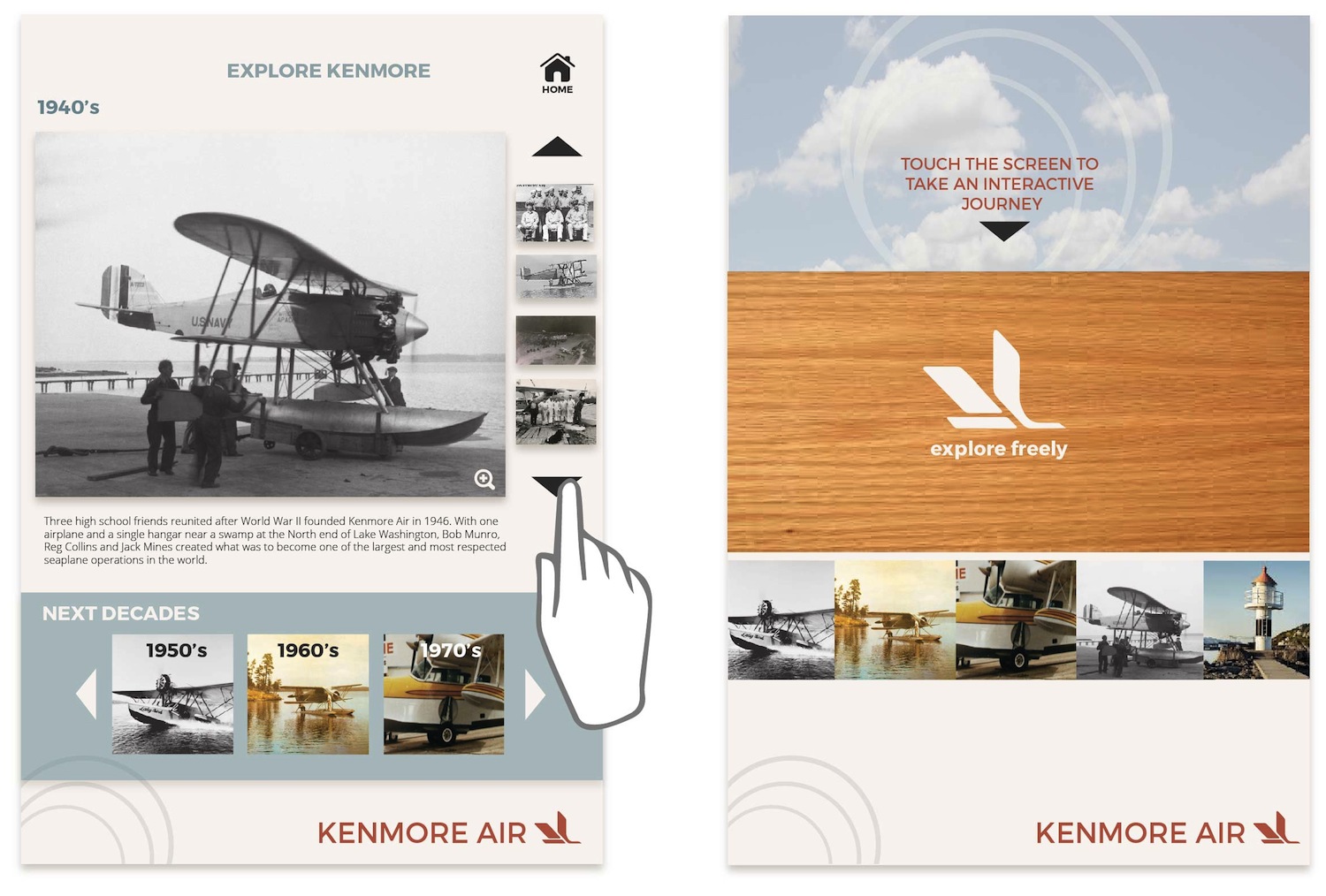
After establishing branding elements, I decided to bring the company's website up to date. I reorganized the hierarchy of the site in response to discoveries made while user-testing the company's existing site. I moved superfulous information off the homepage to add simplicity and ease of navigation to the most commonly visited elements. An interactive map was added which allows the user to pinpoint various desitnations and access details on the specified location to more easily plan vacations. I also designed interactive touchscreens for the terminal which illustrates Kenmore's history and gives customers a fun distraction while waiting.
APPAREL DESIGN
I spent a lot of time thinking about this component and the constraints that are unique to this business. The company wants to relay a casual but professional look and employees need clothing that can be worn throughout most of the year but, in particular, protect them from the cold and damp that comes with working next to the water. I created a fashion-forward, versatile coat with a removable hood and lining that can be worn for most of the year in the Pacific Northwest.
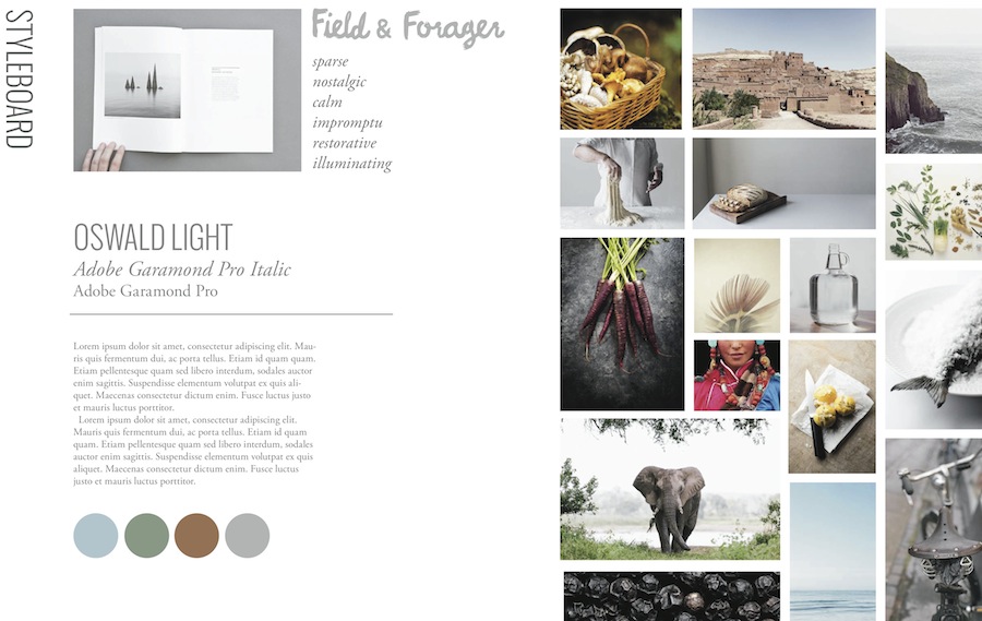
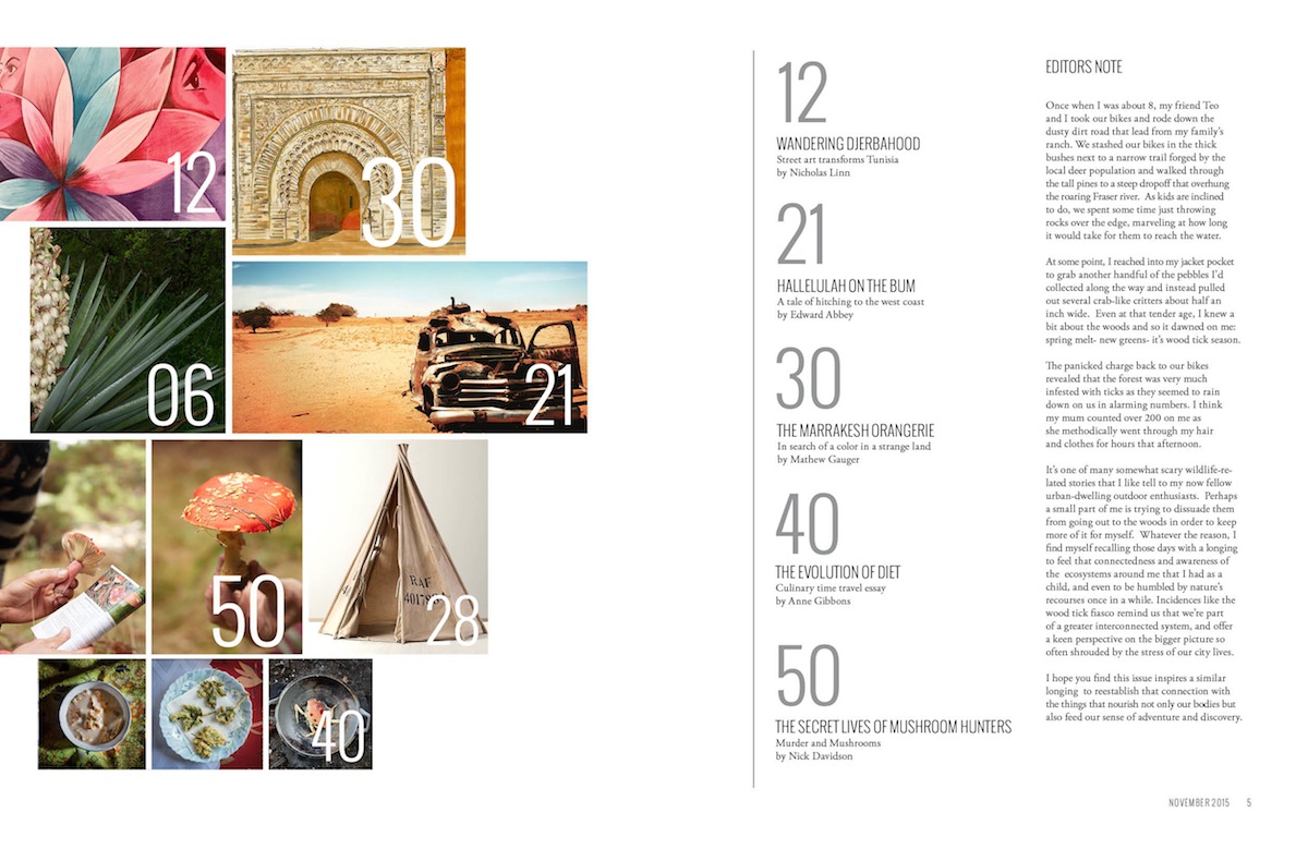
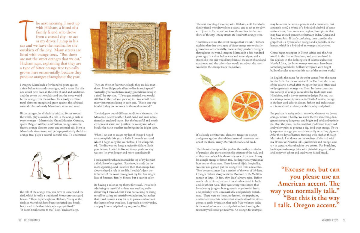
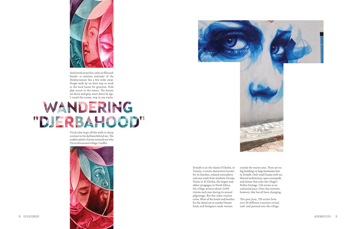
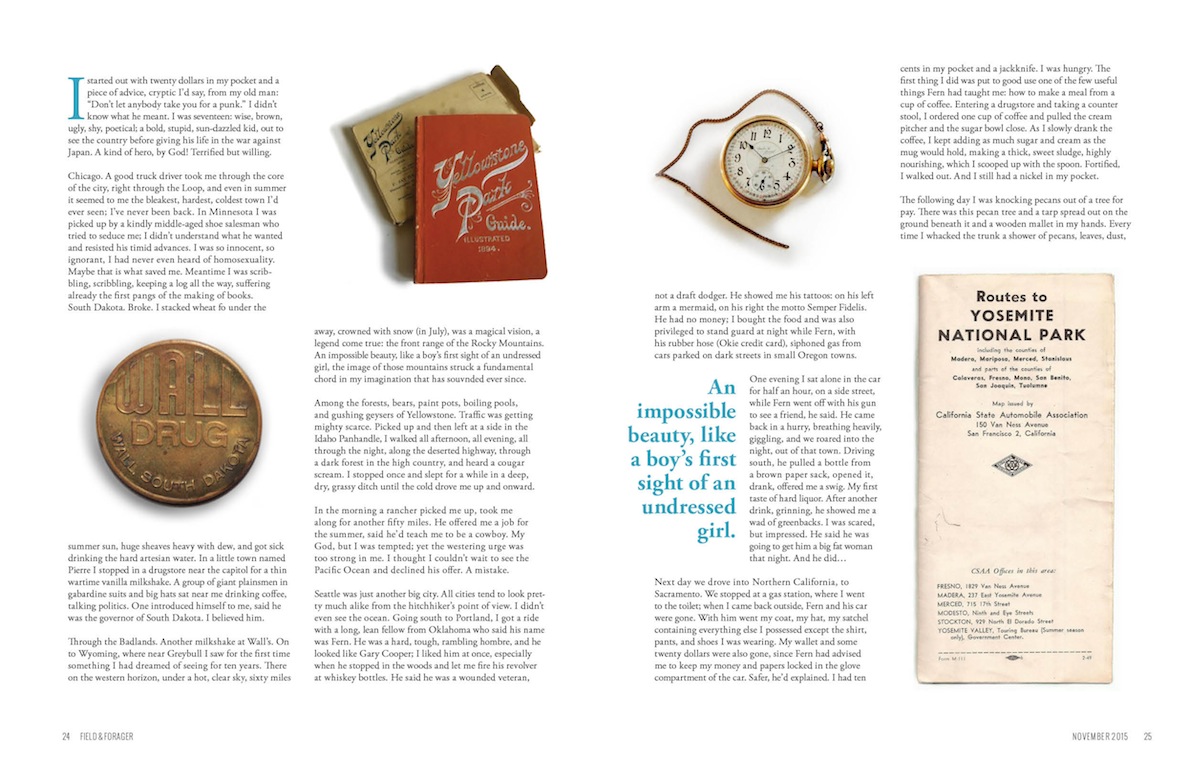
A Quarterly Journal for Adventurous Foodies and Curious Wanderers.
Genre: Travel, Food, Writing
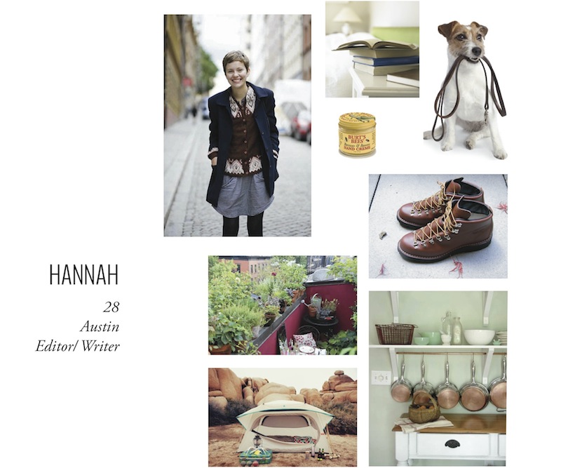
General Audience: American suburbanites in tech or design careers, aged 30-45
SYNOPSIS: Field & Forager is a quarterly collection of stories about unconventional travel and related articles of food destinations and recipes. Field references the place, Forager refers to food that might be found at that place.
Design Constraints: Content will be unique and differ from typical travel and food magazines, each issue would include the following articles:
Travel Journal: a first person, casual narrative about traveling to an obscure place, may include sketches of local flora and fauna plus photos Fiction: A story about travel or food that reveals an adventure and discovery
Poem: Written by unknown poets from around the world, offers perspective or insight
Foraging Feature: story about making or finding uncommon food around the world<
Foraging Recipe: recipe that relates to the foraging feature
Foraging Article: list of products, places or restaurants or things to do, related to the Foraging feature
Field Feature: story about a travelers experiences in an uncommon destination
Field Article: list of places or restaurants or things to do, relating to field feature
Field Recipe: recipe that relates to the field feature
Magazine Ads: Curated ad content on each side of back cover. Native ads will be allowed in main content
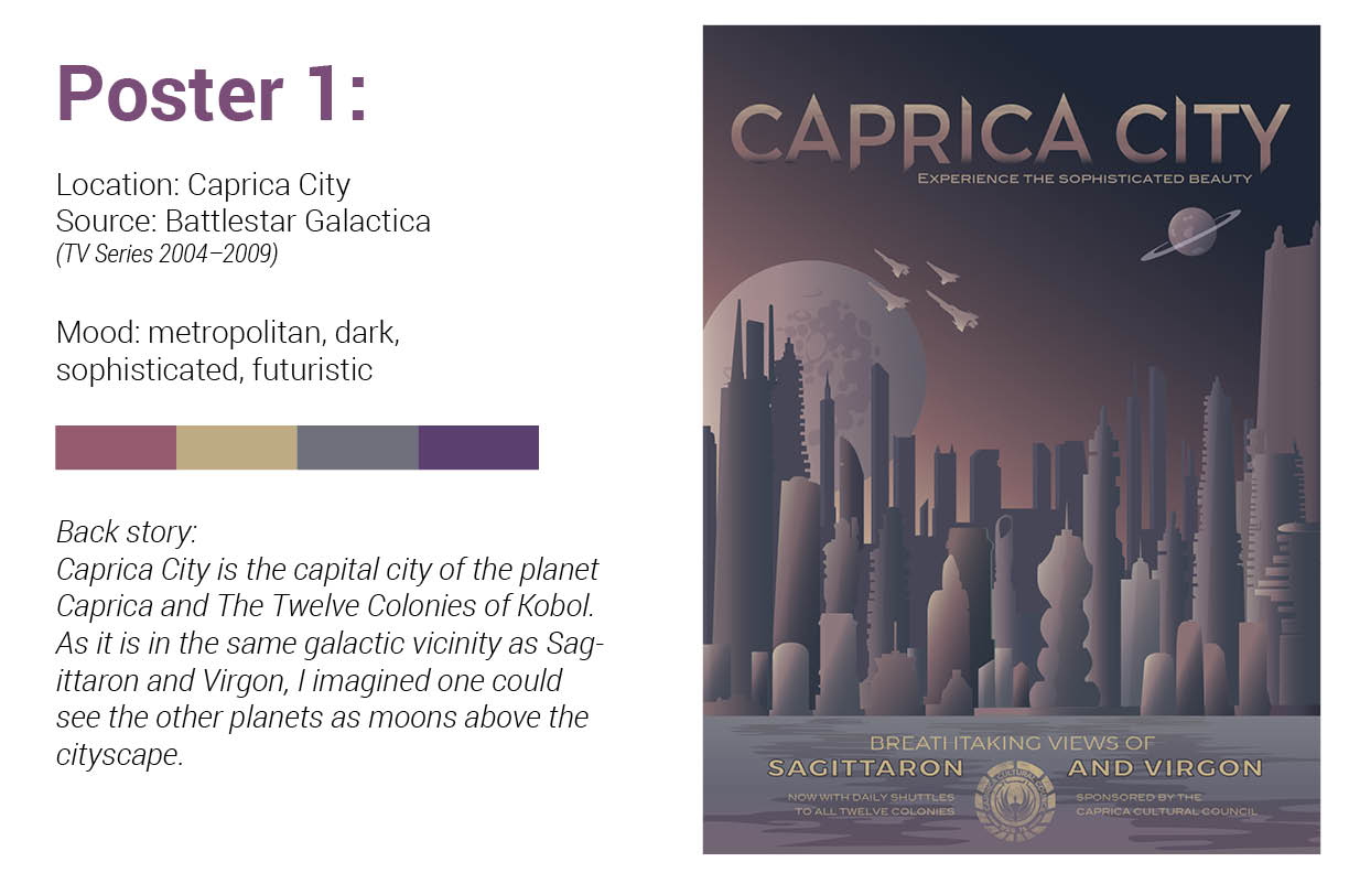
Challenge: Create a series of marketable posters based on places from popular science fiction media.
Solution: Research similar projects to see what has been done. I've always liked the clear communication and vector graphics of the WPA parks posters but wanted a slightly more updated look. I kept the standard layout but added dimension with gradiesnts. I also watched or read relevant episodes of each story to gather details of not only the setting and plot but also get a sense of the tone of the story. Each poster took between 30-60 hours to create; a labour of love.


 Many stories required interaction design. Here is a walk through I showed to stakeholders to illustrate how a recycle bin might work inside a feature called